Yes. It’s absolutely ridiculous, as you’d probably expect. You’ve heard the numbers already: 1,020 peak horsepower from 80mph to 200mph, although it’s electronically limited to 163mph pending a software update. It launches crazy fast off the line – 0-60mph in 1.99s. But everyone knows electric cars can do that. The most impressive part of this car’s acceleration and performance, which I didn’t think I’d notice, is the continuous and repeated pick up after that.
So 0-60mph (with a one-foot rollout) in 1.99s versus 2.3s for the ‘Raven’ Model S... they’re both really fast. But there’s a chart that shows the 60mph to 130mph times, which represents the second part of that acceleration, and the difference is much more obvious. The Plaid does that in 4.7s, which is twice as fast as the Raven’s 60mph to 130mph. You can absolutely feel the difference.
That’s really quick.
Let’s say you go to an NHRA-sponsored drag strip. If you do the quarter mile in under 10 seconds or at over 150mph, you need a parachute, otherwise they won't let you do it. And this car does a standing quarter mile in 9.3s at 154mph on a regular basis, so you'd get kicked out of a drag strip if you pulled up with this car and just did a regular run. That’s crazy.
What does that actually feel like?
It's like a different feeling in your chest, the linear acceleration. It's basically a missile. And in theory, none of this should matter to regular people, most people will never use any of that, but it is crazy that a road car can have that sort of performance.
It's also the car that I went and got groceries in last night, and it handled both those things as good as any car could.
Speaking of doing ‘normal’ things, how’s the Plaid fare on that front?
On a 600-mile road trip I did straight after collecting the car, I got to deal with a fair bit of daily driving, which – in every single way except one – is world-class. The cabin noise is great, the new added storage in all the doors is very plush, the new seats are very comfortable, and on paper, it's the most aerodynamic production car ever.
Now, I'm looking at my watt hours per mile. I never really got it down below 300 watt hours per mile like I did in the Raven Model S, but I think a part of that is because of the 21in tyres. But I hooked up to this V3 supercharger on the way home with exactly four miles of battery left, which is pretty much ideal conditions, and sure enough, I saw it adding 900 miles an hour back to the battery at 250kW.
What about the screens?
Very impressive. But I think the back screen is probably one of the most overhyped or overrated features. It's great for air conditioner controls and all that, but the second you try to play games on it or watch YouTube videos, you realise it's a little too small and a little too far away to be really useful or really fun for that sort of stuff.
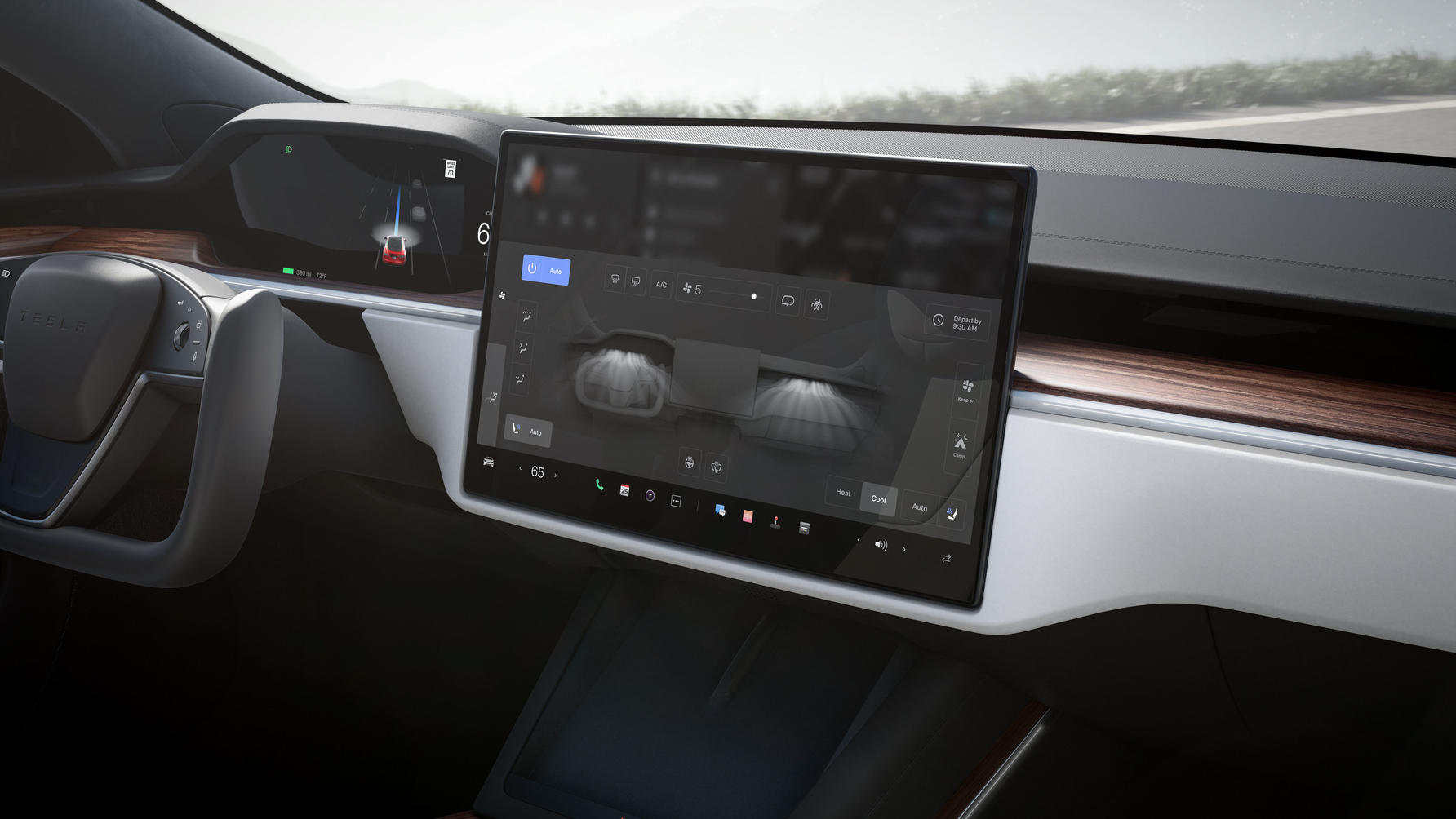
The new screen up front though is great. It's obviously now landscape and much more well-integrated into the dashboard than the Model 3's landscape screen, and the software is actually even newer and it's much more responsive than the last Model S and even the Model 3's.
It's really quick and snappy – not just lag free but satisfyingly quick. Even the browser, which was pretty slow in all the other Teslas, is acceptable to use now. The new dock at the bottom is the nice part. It's customisable and makes a lot of sense. You end up with your most used toggles there wherever you want them. For me, it's Bluetooth to my phone and Spotify. The energy graph is gone though, which I found really useful and I suspect that's not coming back. But you want the screen to be good since so many of the controls are there, and it is.
Also, they moved the USB port for the dash-cam into the glove box, so if you pop open the glove box, that reveals a hidden USB port and actually includes a USB stick for Sentry Mode and dash-cam. The only real bug I've found is sometimes resizing or moving the windows around, which is a new feature, can glitch out a little bit, or snap the wrong way. This is one thing I know they can definitely improve with a software update so I'm not too worried about that. Also there's no button to view either Sentry Mode or dash-cam clips - you have to ask the voice control to open that viewer. Again, another easy software update fix.

Let me guess, the ‘one thing’ that isn’t world class is the steering yoke?
The steering yoke itself isn't actually the part that's bad – it's the buttons on the yoke that amplify the relearning of everything.
Technically, one upside of this setup is you have better visibility of the screen behind the wheel (which is always in dark mode for some reason). It's cool too, such a conversation starter – it feels like a video game controller. It also forces you into a textbook driving position with your hands at three o'clock and nine o'clock.
But that's where the upsides end and the laundry list of downsides begin.
Uh oh.
Firstly, you're adjusting the way you hold the wheel. Secondly, every time you grab the wheel and turn it your hand brushes some of these buttons. The layout of it is actually fine and pretty easy to get used to: on the left-hand side you've got indicators – up to go right, down to go left, with some haptic feedback. Same thing with the headlights.
On the right, there's a voice controller button, windshield wiper button – single press for one wipe or a firm press to turn them on. And then there's a little autopilot indicator and the horn. Actual clicking buttons would have made a huge difference here.
Also, the horn: maybe I'm missing something, but couldn't they have stuck with a regular horn? Imagine you're driving, somebody cuts you off or is about to do something dumb right in front of you. You have this reaction to just hit the horn... and that's where the airbags are. Everything is a slow muscle memory remap. I'm a pretty tech-forward person, I feel like I'm going to eventually click to the point where I hit the buttons correctly every time, I don't miss the touch targets and I eventually am as proficient with this as I used to be with the wheel. But people with 40, 50 years of driving experience, half a million, a million miles, it's going to take them longer to flip that switch.
Anything else?
The drive modes. So again, there's no stalks here or any drive selector. Anytime you're at low speed and you put your foot on the brake, you get a strip that pops up from the side of the screen where you can swipe up to drive, or swipe down to reverse.
It's a little narrow and my muscle memory hasn't really dialled into perfectly hitting it every time yet. And the yoke is actually so wide that it kind of blocks part of the view of the corner.
There are two other solutions to this gear changing problem that feel are even more of a workaround. There are some buttons right underneath the wireless charger, and they're fine but they do take an extra half second while you're pressing them to activate, so they feel a bit less responsive.
The other that you might've heard about though is auto shift. And I thought this would be an ‘on all the time’ thing, but it's a feature in beta that works when the car is in park. And when the car is in park, it will remember how you got into that parking spot or look at what's around you and guess how you'd like to exit park. So if you're in your driveway with a wall in front of you, it will give you the option to tap the brakes and it'll switch into reverse for you.
Any final thoughts?
In my ideal version I wouldn't take the regular wheel back. I’d take the yoke plus regular clicking buttons, so we'll see how long Tesla runs with this. Feels like the yoke is here to stay...


